The Weighted Average Illusion: Biases in Perceived Mean Position in Scatterplots
Matt-Heun Hong, Jessica Witt, Danielle Albers Szafir
External link (DOI)
View presentation:2021-10-28T17:30:00ZGMT-0600Change your timezone on the schedule page
2021-10-28T17:30:00Z
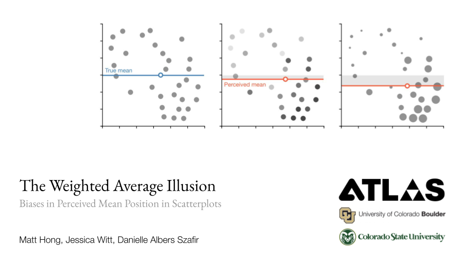
Abstract
Scatterplots can encode a third dimension by using additional channels like size or color (e.g. bubble charts). We explore a potential misinterpretation of trivariate scatterplots, which we call the weighted average illusion, where locations of larger and darker points are given more weight toward x- and y-mean estimates. This systematic bias is sensitive to a designer’s choice of size or lightness ranges mapped onto the data. In this paper, we quantify this bias against varying size/lightness ranges and data correlations. We discuss possible explanations for its cause by measuring attention given to individual data points using a vision science technique called the centroid method. Our work illustrates how ensemble processing mechanisms and mental shortcuts can significantly distort visual summaries of data, and can lead to misjudgments like the demonstrated weighted average illusion.