Kineticharts: Augmenting Affective Expressiveness of Charts in Data Stories with Animation Design
Xingyu Lan, Yang Shi, Yanqiu Wu, Xiaohan Jiao, Nan Cao
External link (DOI)
View presentation:2021-10-29T13:15:00ZGMT-0600Change your timezone on the schedule page
2021-10-29T13:15:00Z
Fast forward
Direct link to video on YouTube: https://youtu.be/e-CXSOpKuyY
Abstract
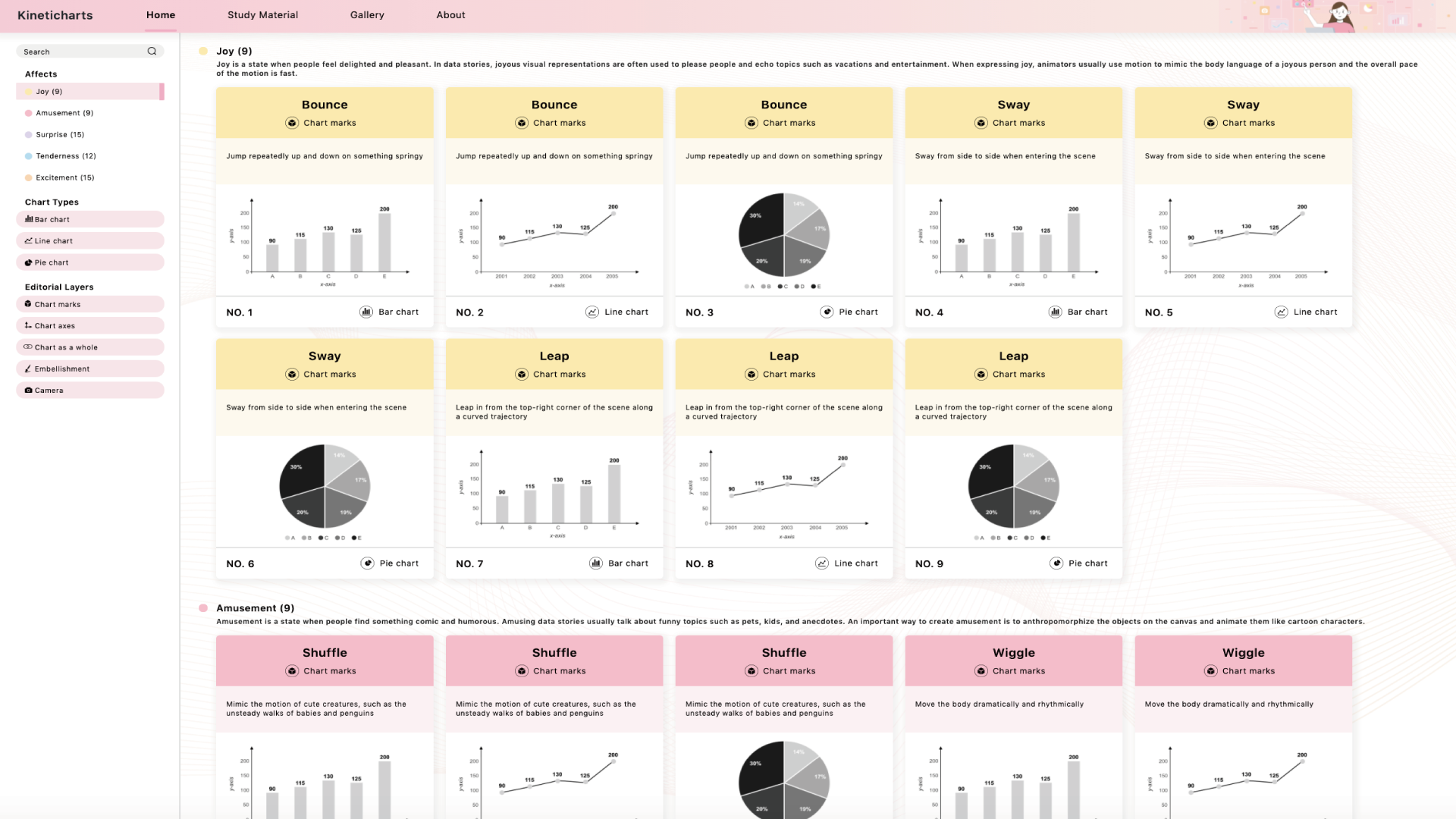
Data stories often seek to elicit affective feelings from viewers. However, how to design affective data stories remains under-explored. In this work, we investigate one specific design factor, animation, and present Kineticharts, an animation design scheme for creating charts that express five positive affects: joy, amusement, surprise, tenderness, and excitement. These five affects were found to be frequently communicated through animation in data stories. Regarding each affect, we designed varied kinetic motions represented by bar charts, line charts, and pie charts, resulting in 60 animated charts for the five affects. We designed Kineticharts by first conducting a need-finding study with professional practitioners from data journalism and then analyzing a corpus of affective motion graphics to identify salient kinetic patterns. We evaluated Kineticharts through two user studies. The results suggest that Kineticharts can accurately convey affects, and improve the expressiveness of data stories, as well as enhance user engagement without hindering data comprehension compared to the animation design from DataClips, an authoring tool for data videos.